
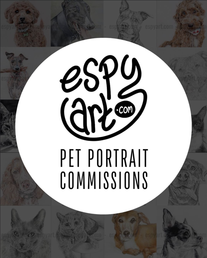
I’m treating Espy Art to a well-needed makeover, and I’m super proud of how its looking so far! I’ve been busy switching everything over to the new logo, such as my profile pictures and cover photos on various social media profiles.
I just checked on the Wayback Machine and it seems that my original logo was being used on my site over 11 years ago and, whilst I did make some subtle changes over the years, I’m amazed its taken me so long to give it a proper upgrade.
I drew the new logo by hand, just like my original one, as I want as much of my business to be made by me as possible – it really is a one-man-band here. I sat and sketched out SO many variations, seriously, my own business name started to lose all meaning after repeating it over and over and over.
Then I spent far too long choosing a font for the words below it, eventually landing on this one which I feel works well in contrast with the lowercase logo.
No doubt I’ll want to adjust it all again soon, but done is better than perfect, right?
Goodbye to the teal!
As you have probably noticed, teal/turquoise has been my main colour for at least 5 years and to be honest, things have changed a lot since I picked it and I felt it was time to move on. Also, I wasn’t really liking how the cold, greenish hue looked against my artwork on social media, so its gone. I’ll be trying to stick with black and white from now on, then to add some warmth to my stall I’ll add wooden elements like picture frames and paint palettes.
Soon I’ll be showing off my new stall display and hand-painted sign, so keep an eye on my events calendar and come along to one of my markets to see for yourself.
Espy Art over the years
Below are some examples of how my logo has evolved since I started on this pet portrait journey, I’m excited to see how things will look in a few more years:


